I’m Ashari, a new grad with a graphic design BFA, that’s based in Mobile, Alabama. I focus on publication design and brand identity. I use my background of photography, painting, and writing to enhance my work. I’m currently seeking employment!
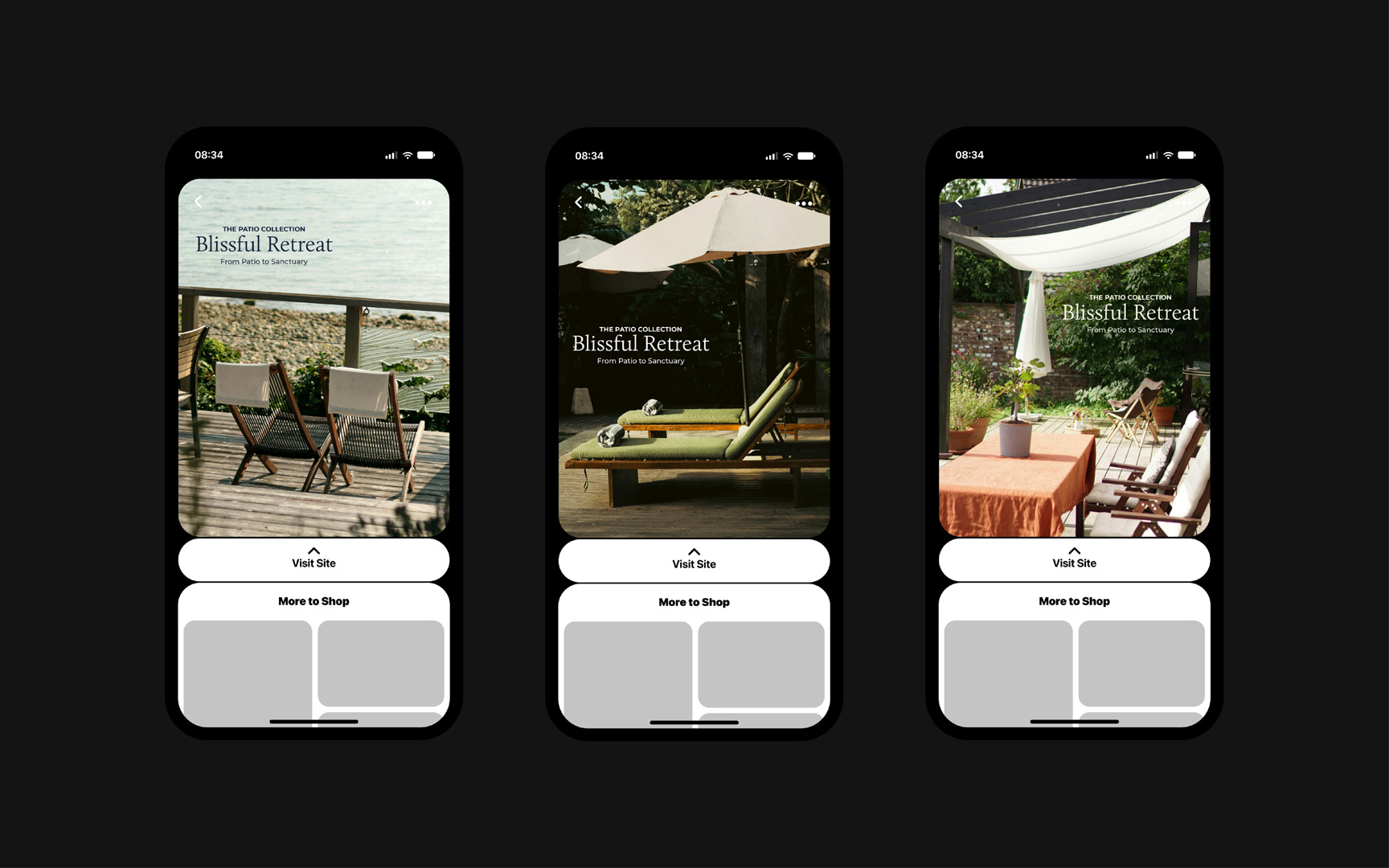
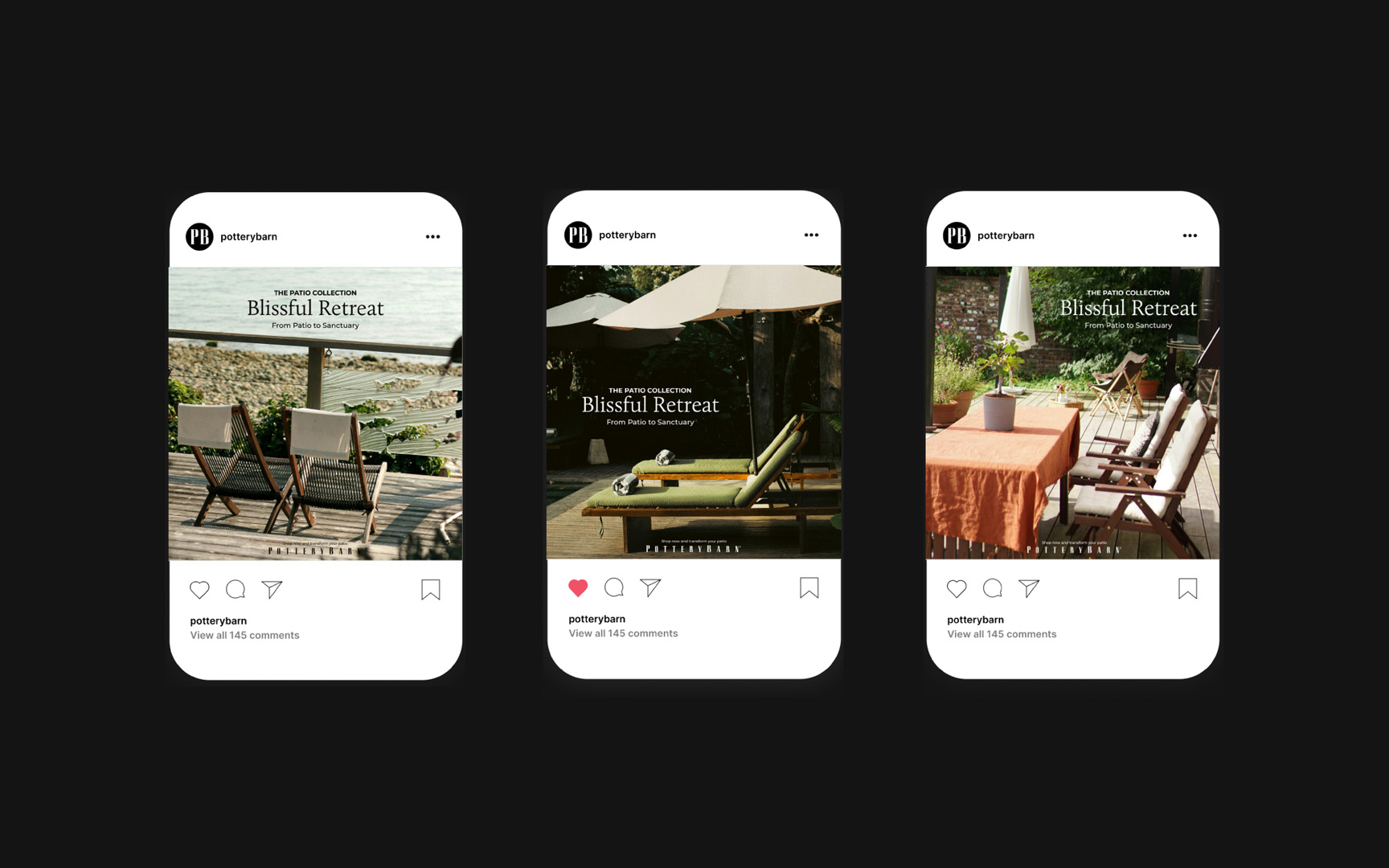
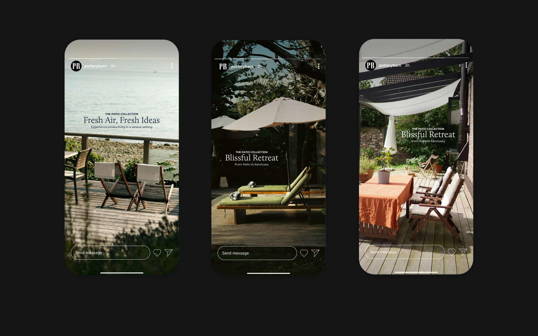
The goal of this project was to follow the brand standards guide for Pottery Barn to produce a series of three social media ads that can be reformatted for use on several platforms.
publication, EDITORIAL
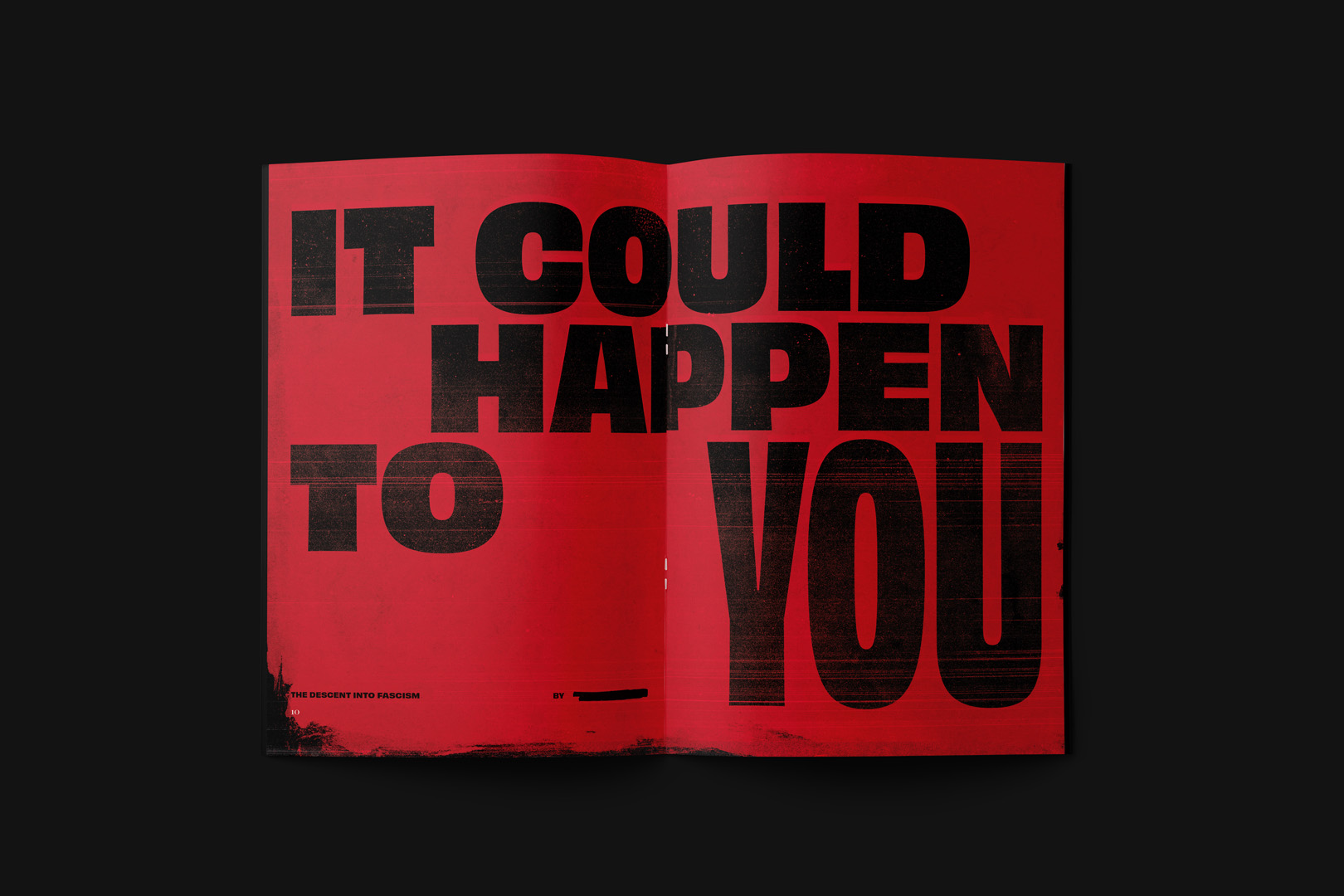
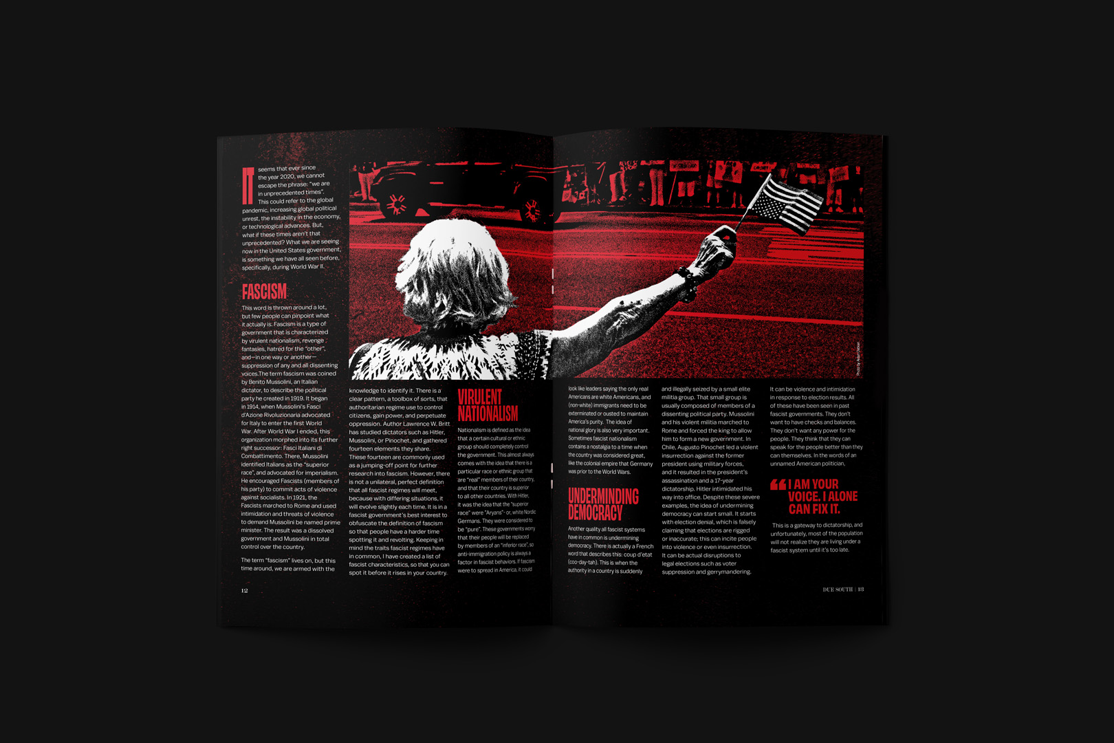
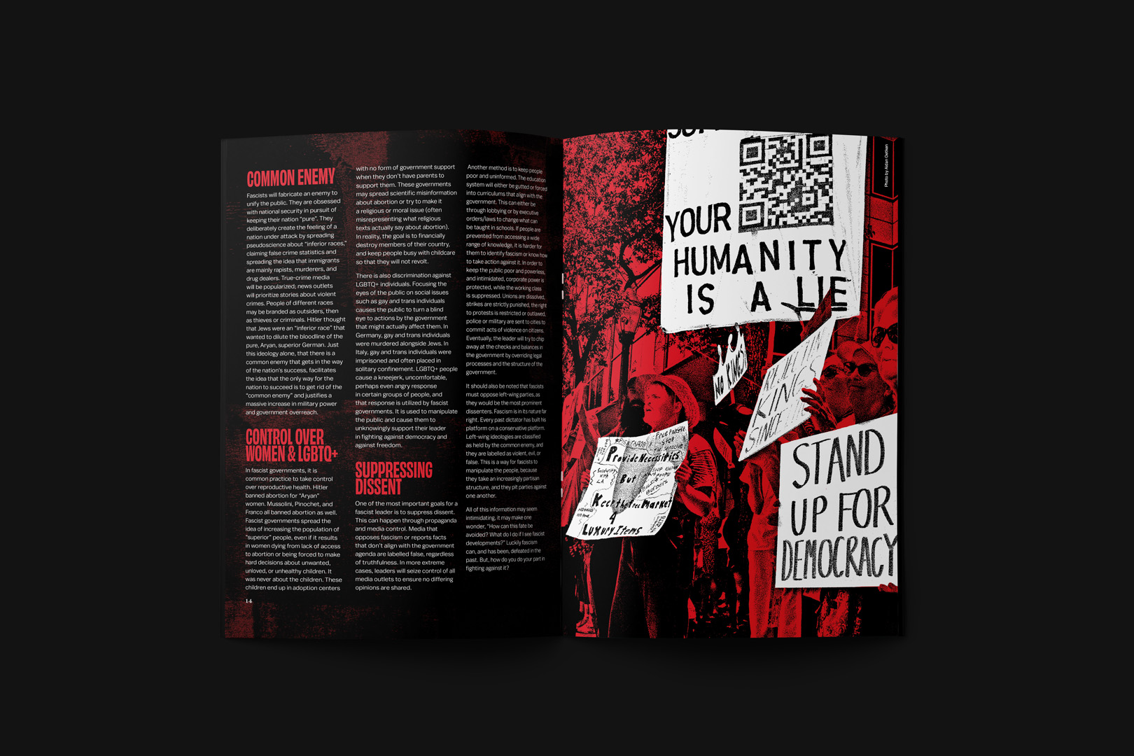
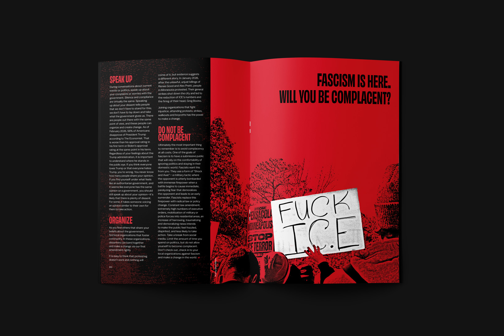
it could happen to you
It Could Happen to You, is a magazine article on identifying fascism, and actions that can be taken to prevent it’s uprising. One of the unique challenges was using color and type to evoke an imposing dread to the audience.
publication, EDITORIAL
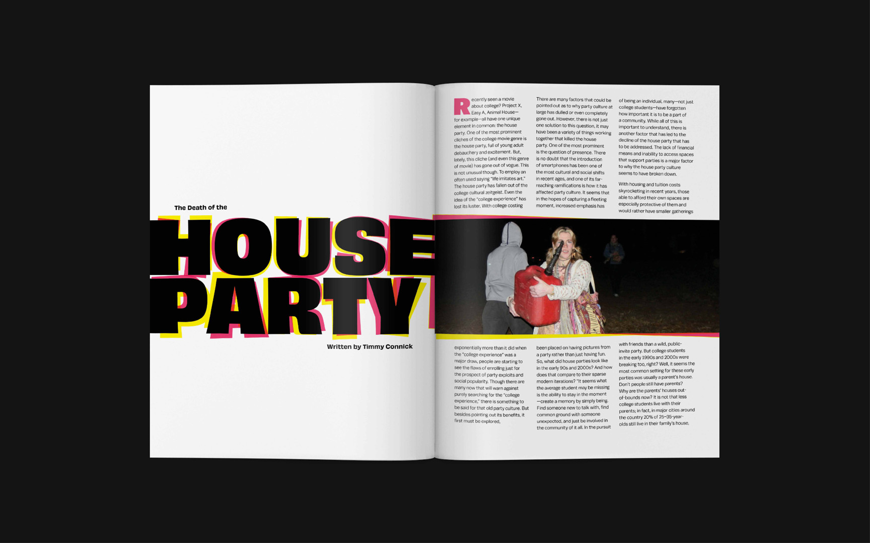
HOUSE PARTY
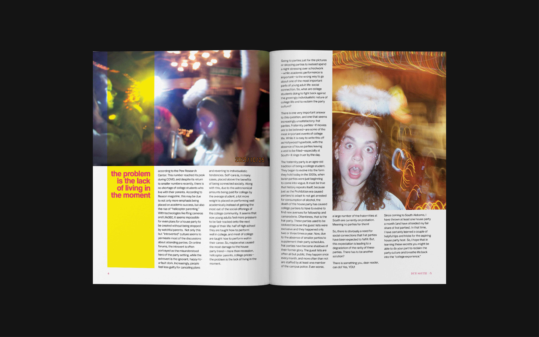
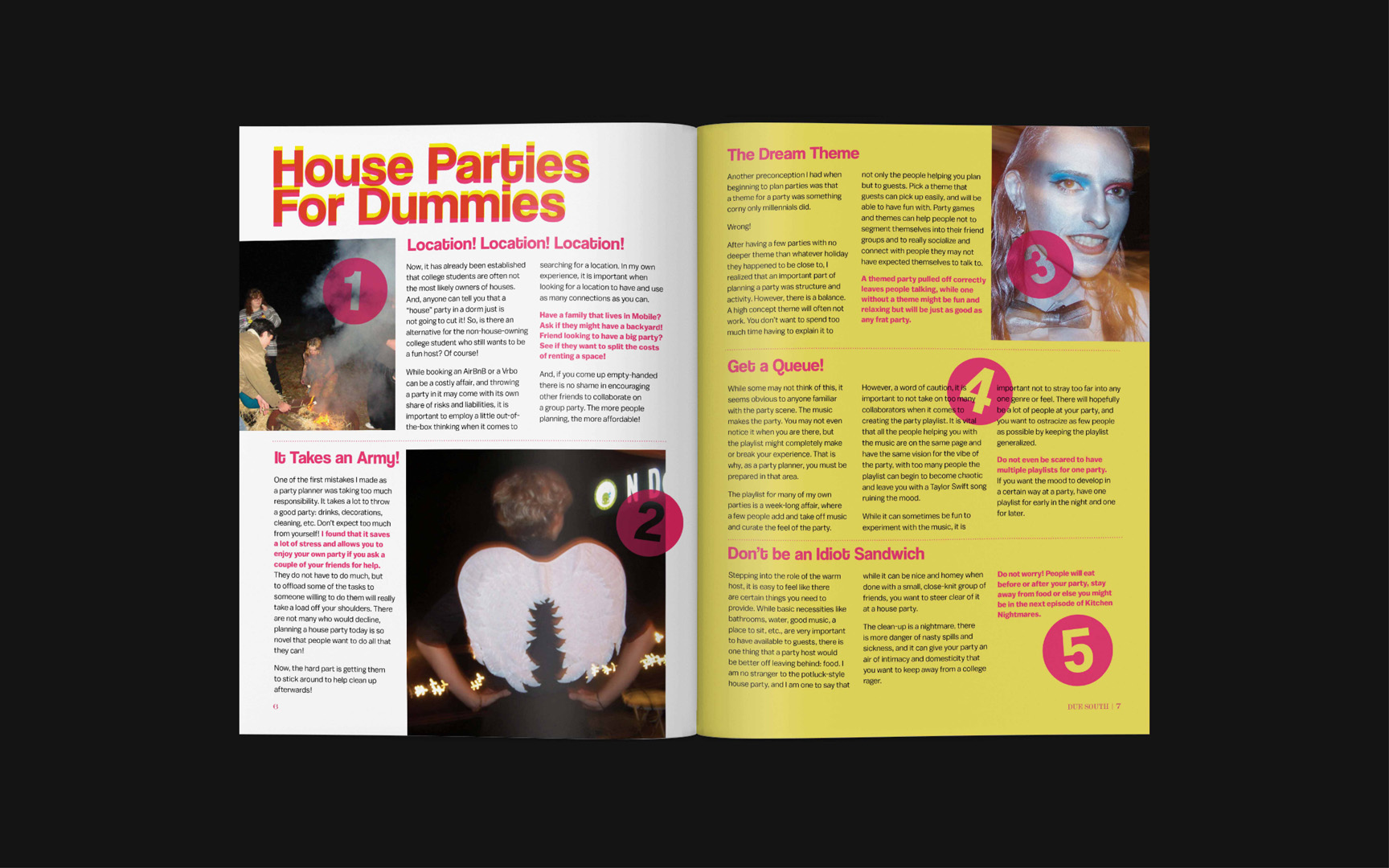
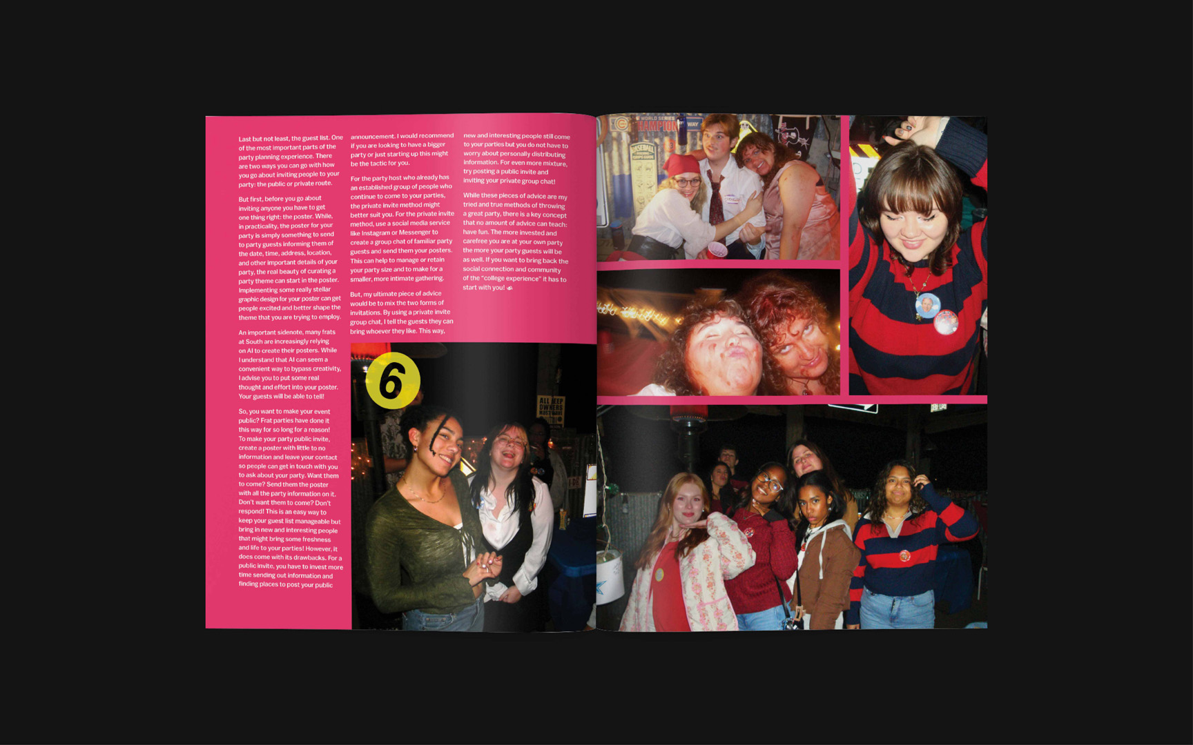
Death of the House Party is a retrospective on house parties of the 2010s. I used heavy, helvetica-esque typefaces with tight leading to give the vintage American Apparel vibe that our 18–25 audience is romanticizing at the moment.
PUBLICATION, EDITORIAL
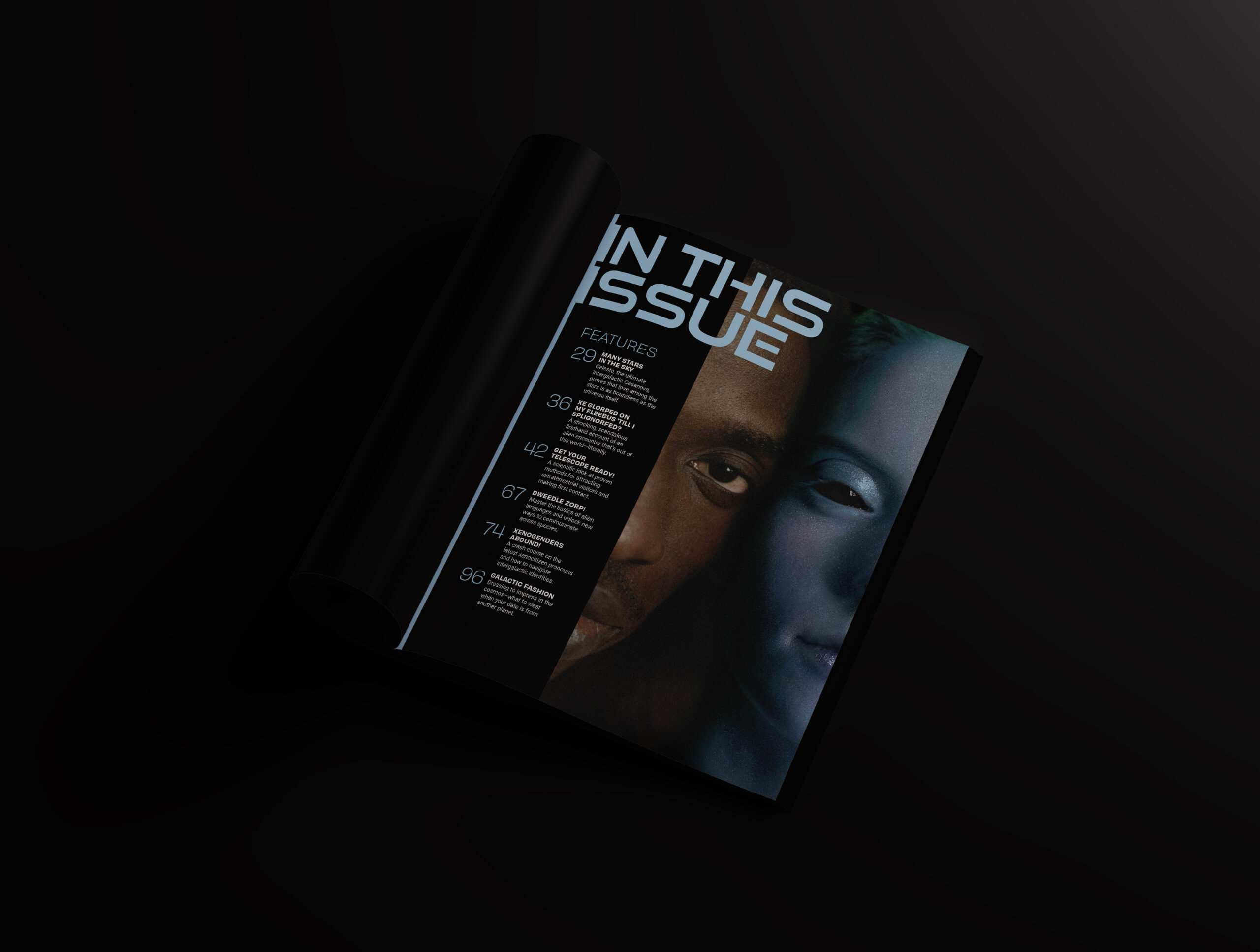
EXOPHILE
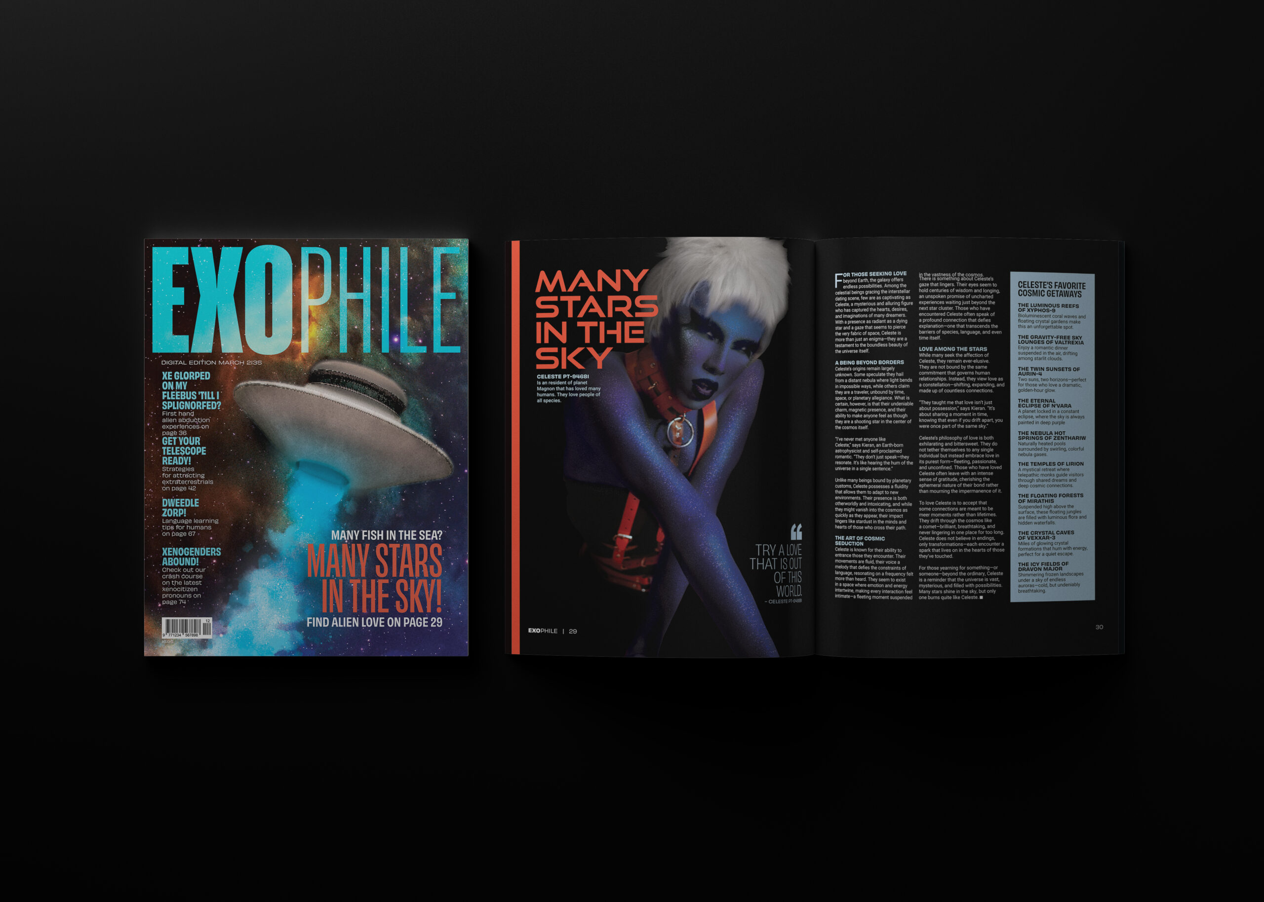
Exophile is a magazine targeting humans, aged 25–35 that are seeking interspecies relationships with aliens. One of the challenges here was handling large swaths of type, as well as using photoshop to create aliens from human models.
Brand Identity
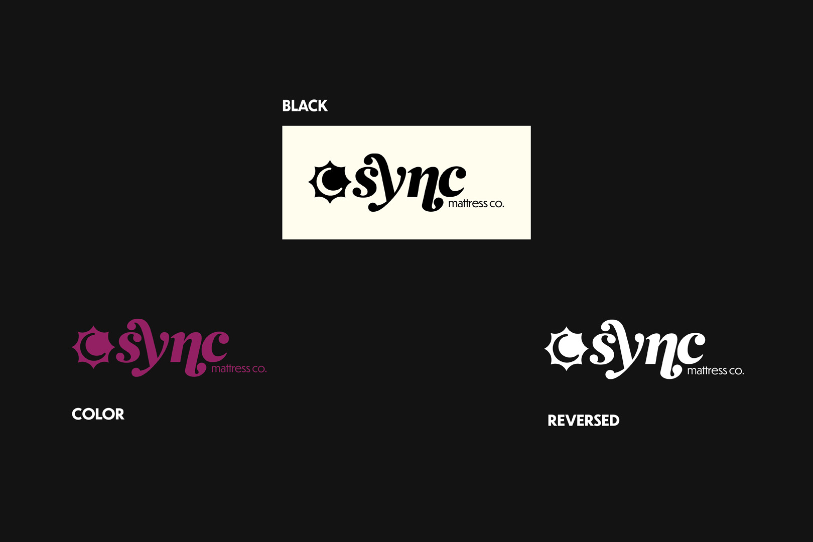
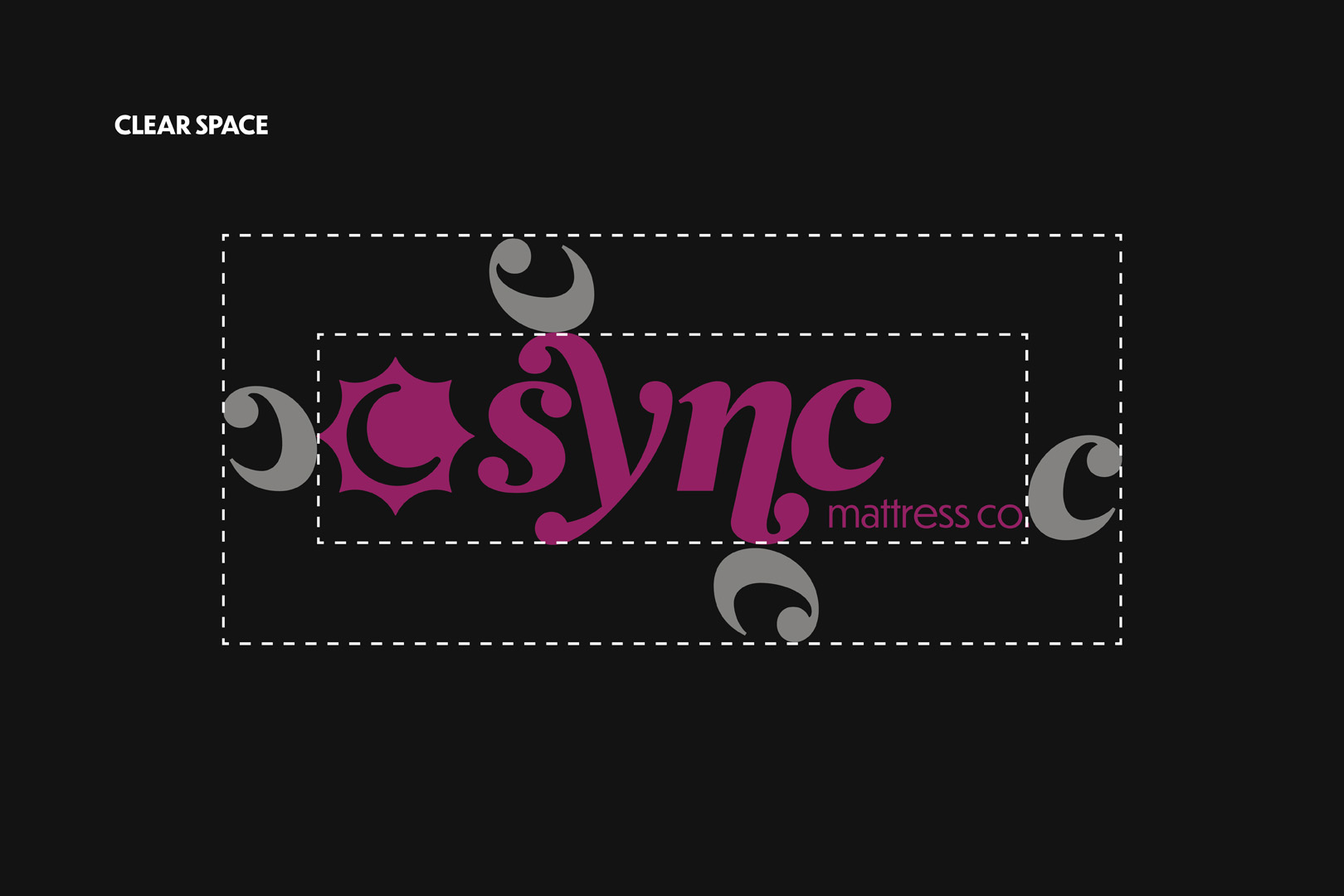
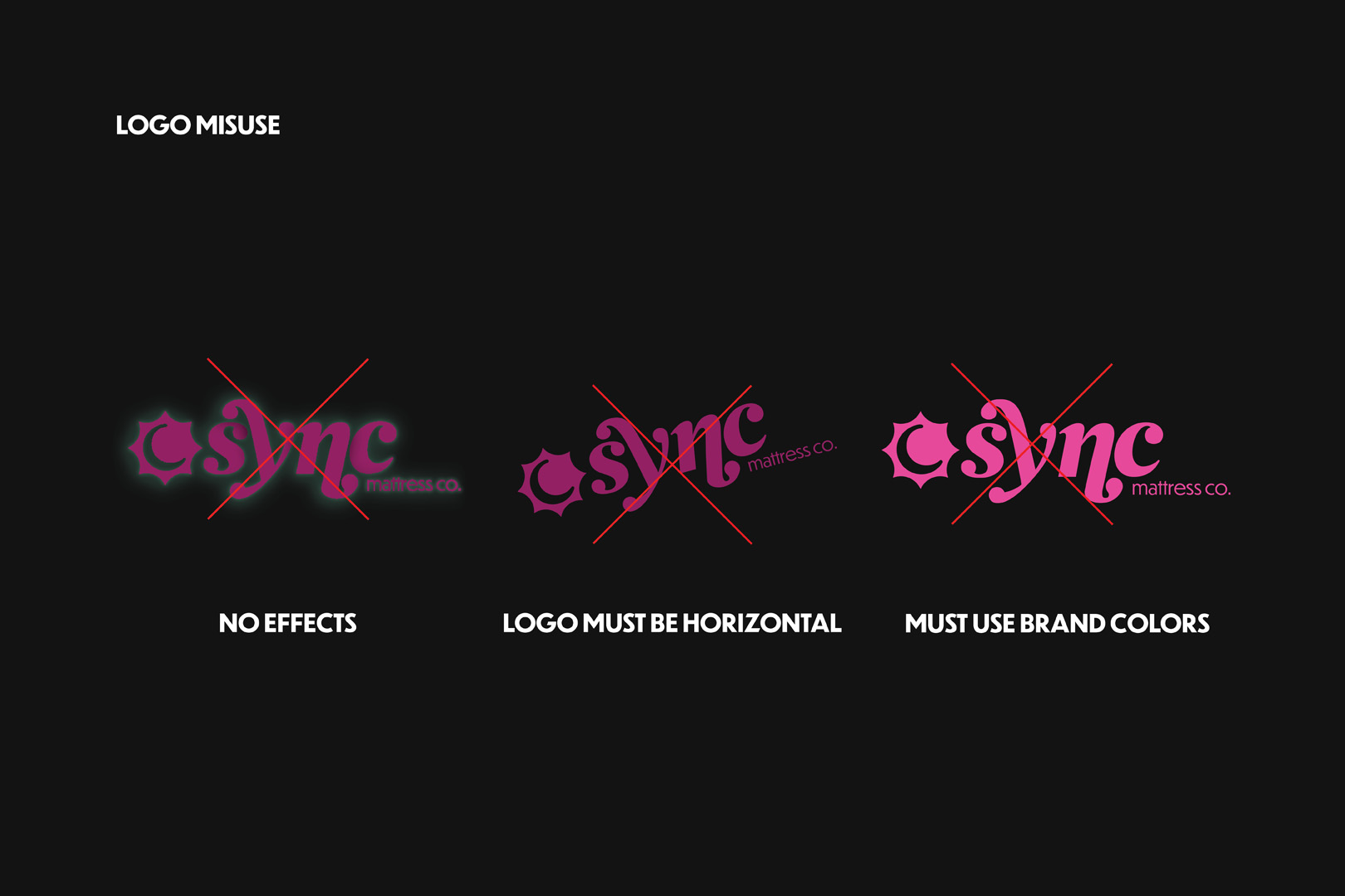
Sync Mattress
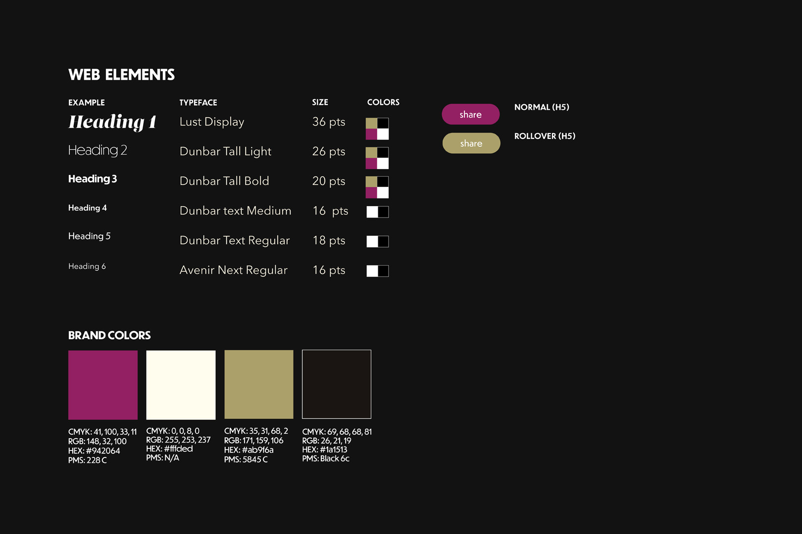
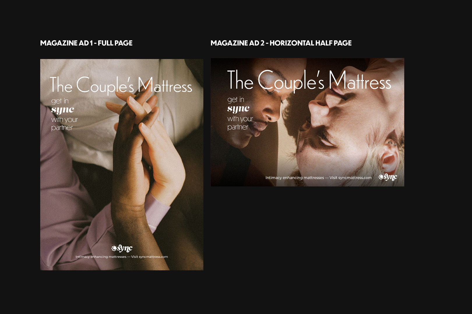
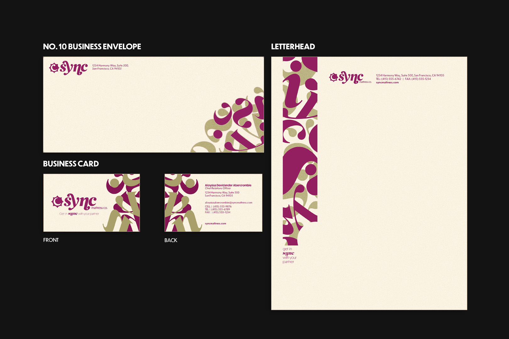
At SYNC, we believe that a harmonious night’s sleep is the cornerstone of a healthy and intimate relationship. Our mission is to create luxurious, innovative mattresses that bring couples closer together, helping them to prioritize their intimacy and well-being. Designed for couples 30 and older, SYNC mattresses cater to those who value connection, comfort, and a calm, inviting bedroom atmosphere.
SOCIAL MEDIA, MARKETING
DIRT MX
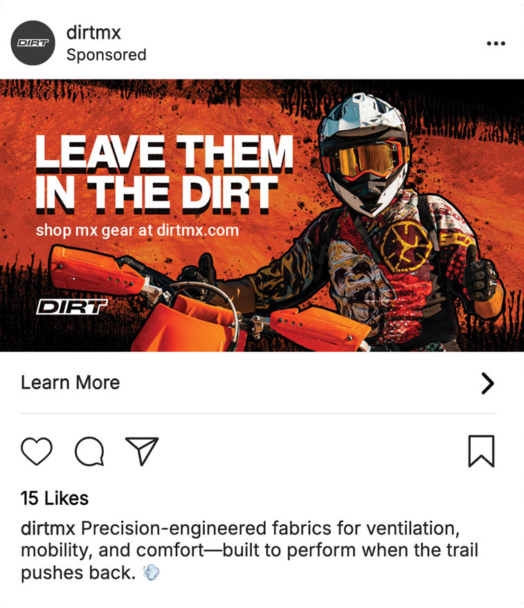
Dirt is a motorcycle brand that can be characterized as gritty, unapologetic, and energetic. The common motif between these social media ads are dynamic compositions and grimy effects.
PRODUCT DESIGN
sparx clothing
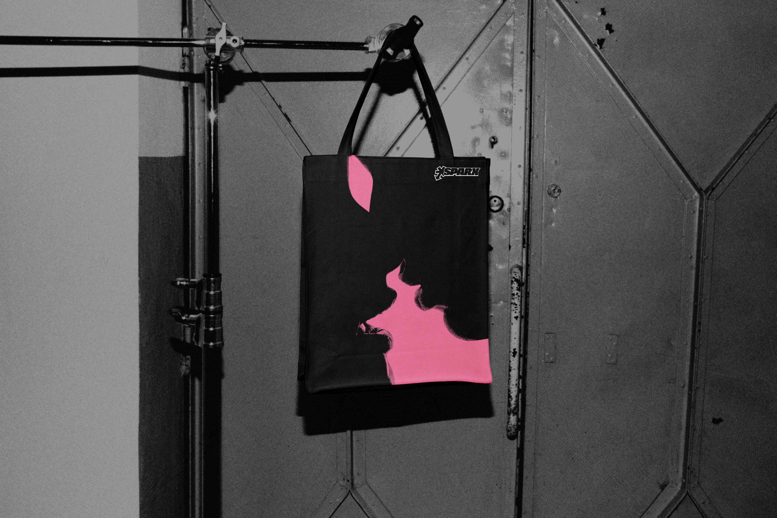
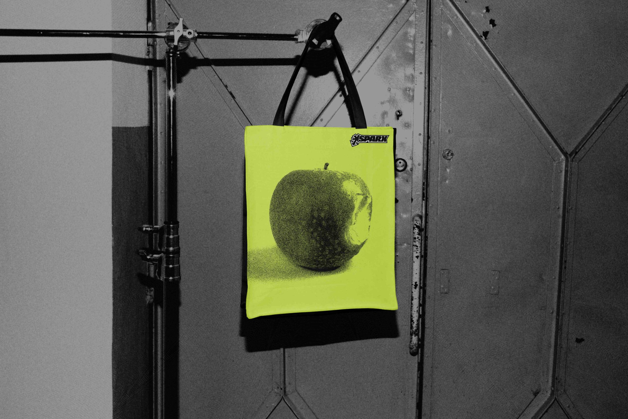
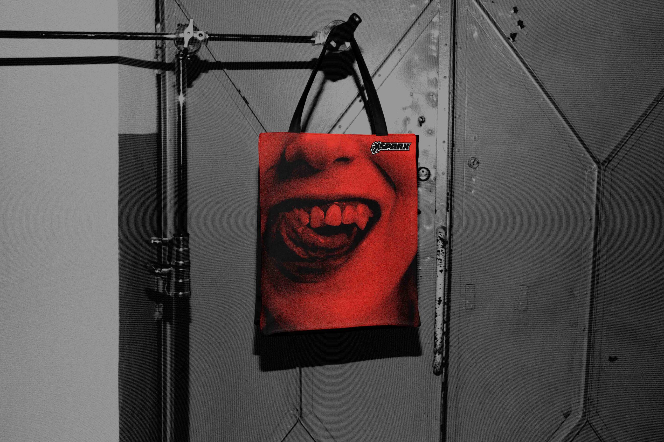
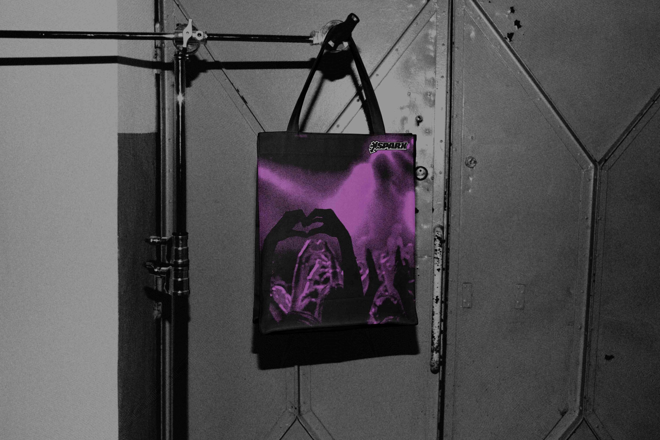
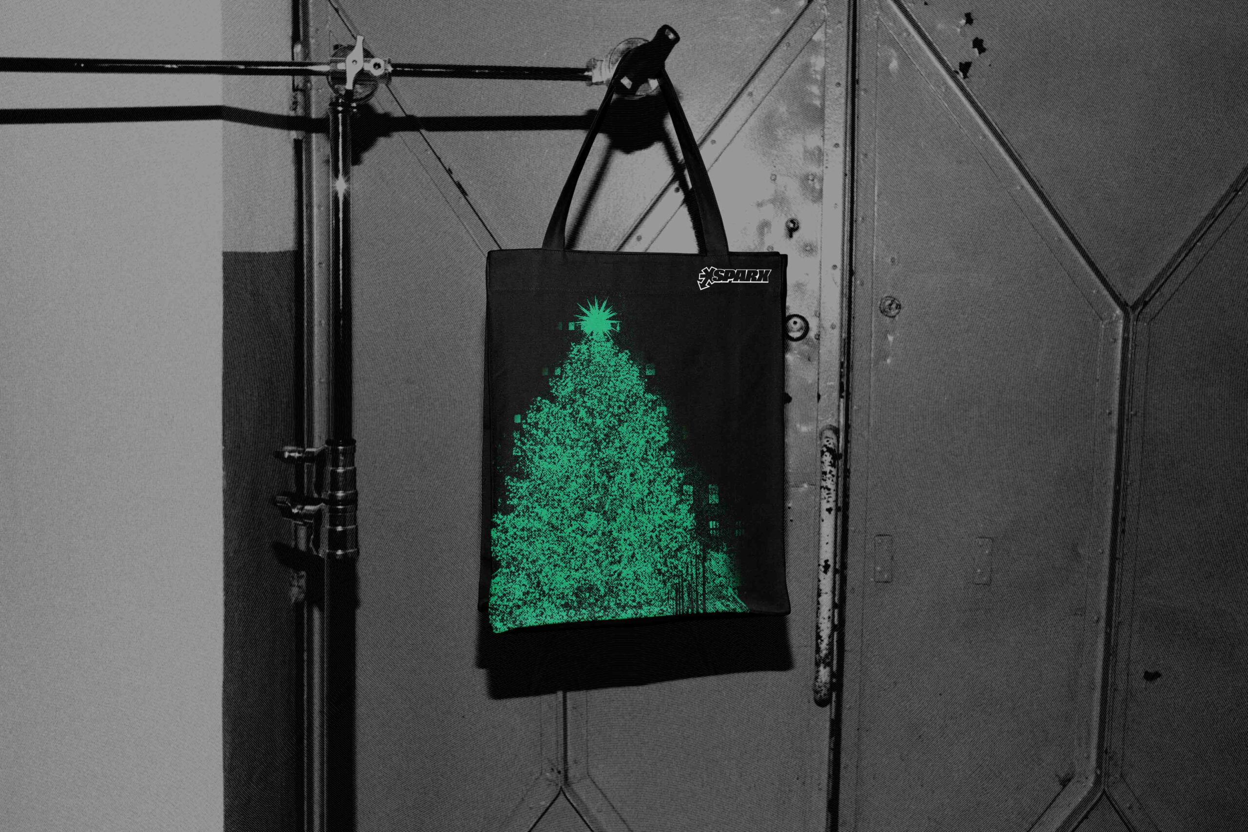
Sparx is a streetwear brand targeted towards young adults aged 18–25. The tote bags are each for a season—Valentines Day, Christmas, Halloween, back to school, and summer fun. The aim of this brand was to follow current trends in music, fashion, and graphics. As of 2026, “Indie Sleaze”, and grunge aesthetics are in, calling for grainy, roughed up graphics.
COLLATERAL
WASTELAND WEEKEND
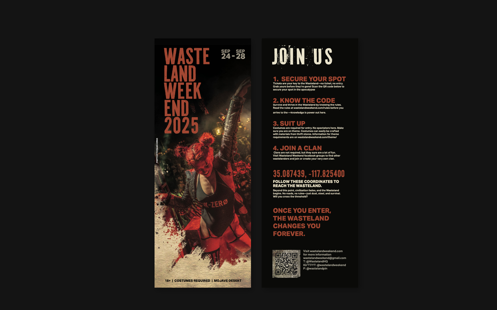
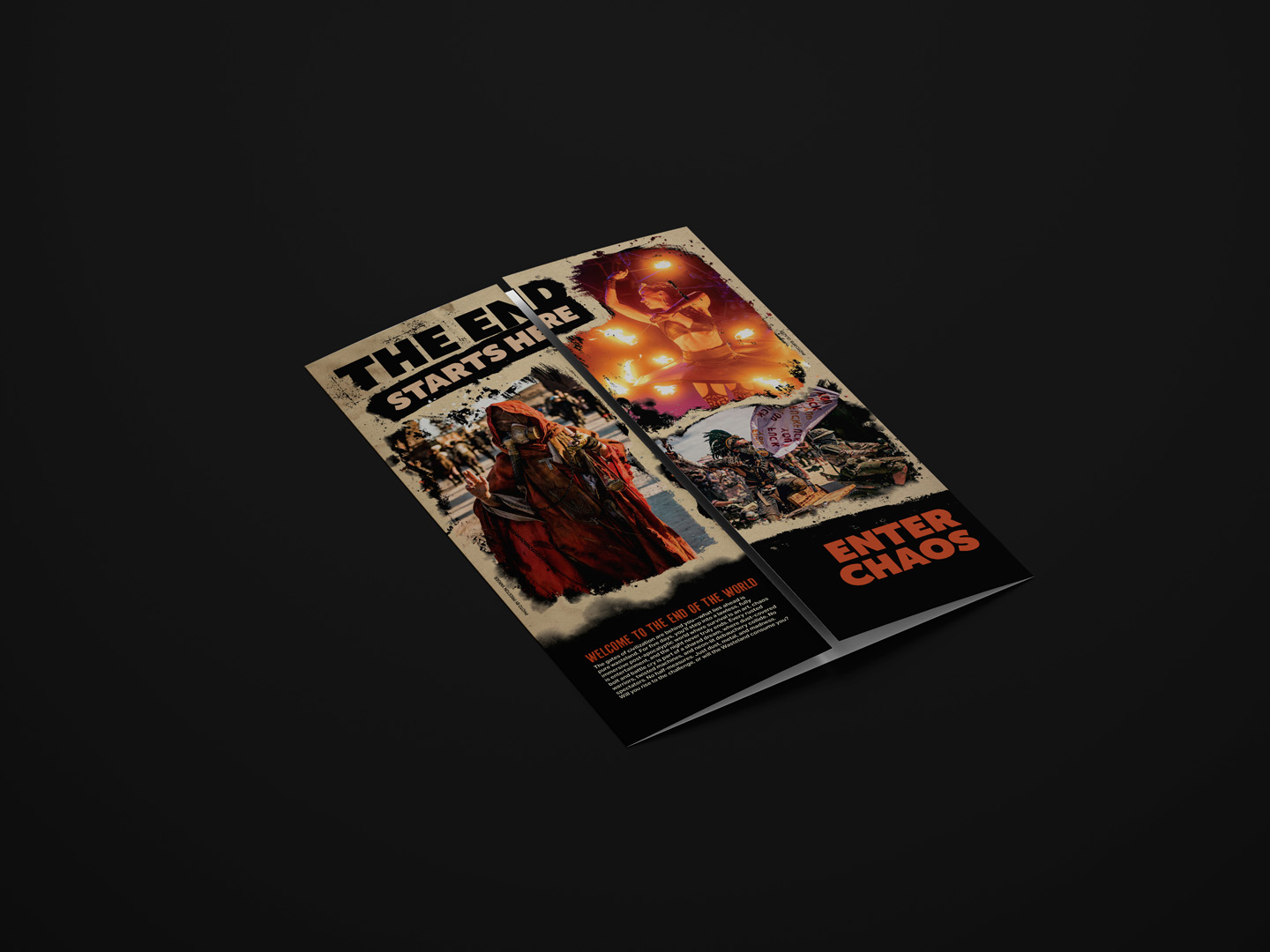
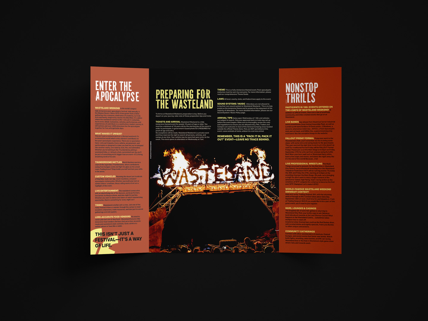
This double-gate fold brochure was an exploration of edgy photoshop textures, and the balance between grungy and legible. It’s an invitation to Wasteland Weekend, an annual, post-apocalyptic LARP festival.
publication
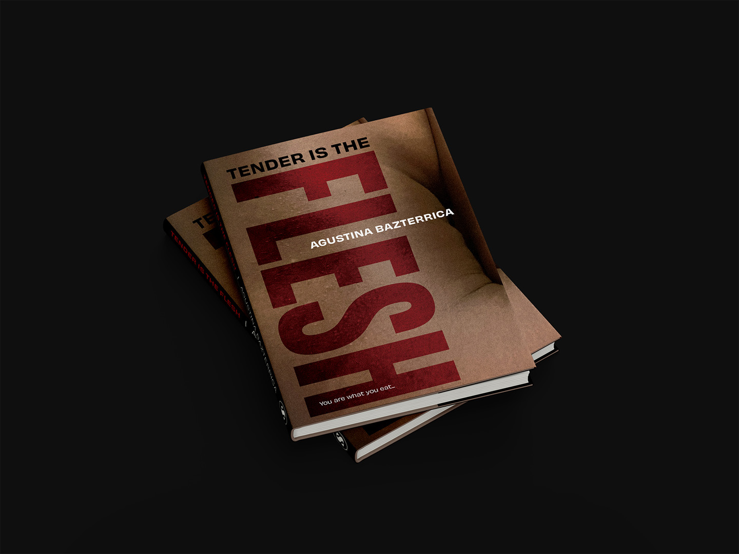
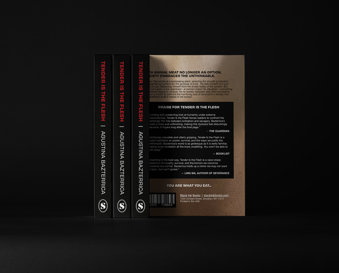
TENDER IS THE FLESH
Seen here, is a book cover for the dystopian novel, Tender is the Flesh. The book depicts a future where cannibalism is normalized and systematized by the government. I use large, imposing type over the nude form to mimic the oppression felt by the people in this story.